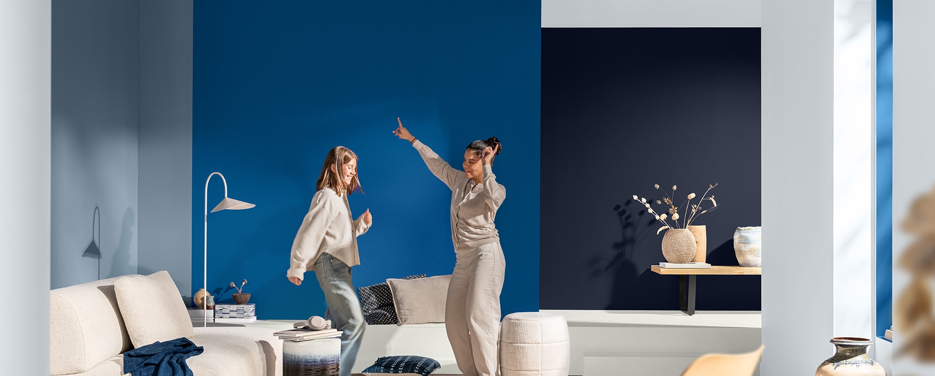
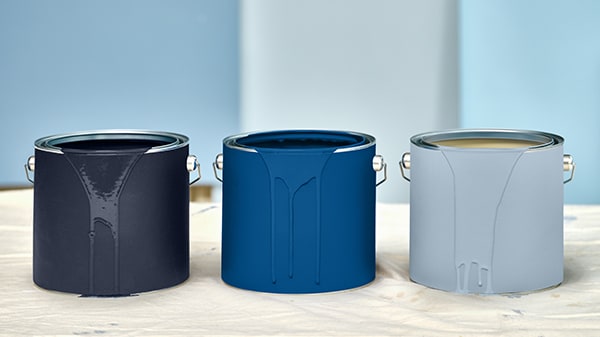
It’s time to dance to your own tune with our Colors of the Year for 2026.
Based on the results of our Global Aesthetic Center’s annual trend forecast meeting, the focus is on your space, your pace.
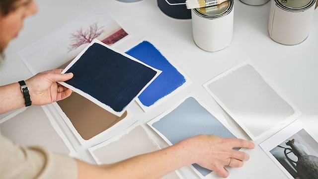
A trio of shades has been developed – the light blue Mellow Flow, the dark blue Slow Swing and the vibrant Free Groove – which take center stage in our color collection for 2026.
Designed to strike a chord in a wide range of markets, Rhythm of Blues features an upbeat and versatile color family which can bring calm, balance and energy.
Along with decorative paints, inspirational palettes have also been created for the aerospace, automotive, consumer electronics, metal furniture, lighting, cabinetry, flooring, building products and architecture markets.
Having worked with architects, interior designers, trend specialists and product developers – who all make important contributions to our in-depth research – it means our soulful collection of blues is perfectly in synch with evolving trends in various industries.
A visual soundtrack to your ever-changing moods.
Let the good times rock ‘n’ roll
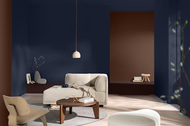
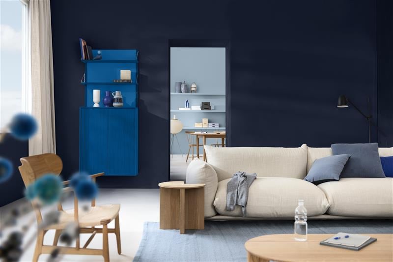
Slow Swing
For a quiet, calming space where we can be still, focus on the things that really matter and recharge our batteries. Switch off with contemplative colors that ooze calm.
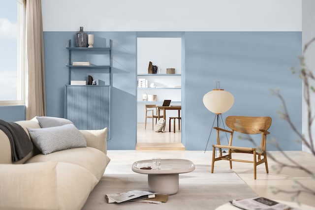
Mellow Flow
For a warm, harmonious space where we can cosy up, welcome people in and be part of the swing of things. Feel in tune with the world and give your walls a hug.
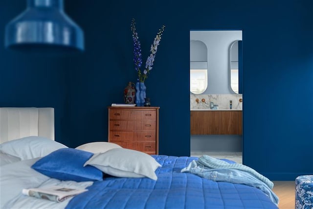
Free Groove
For a light-hearted space where we can think outside the box, have a bit of fun and set our imaginations free. Perfect for an energy injection.

“Because we understand that color is emotion and therefore personal, we’ve chosen a family of colors for 2026. They’re centered around three different rhythms that offer endless scope for changing the pace of your space.”
-Heleen van Gent, Creative Director of AkzoNobel’s Global Aesthetic Center
