Our history
Our Global Aesthetic Center has been responsible for trend analysis, color research, color design and art direction for three decades. Each year, the team engages leading design professionals from all over the world in identifying the trends and capturing the mood of the moment – research which is then translated into color, products and inspiring trend collections by each of our color-based business.
Heleen van Gent heads up the Netherlands-based creative team in supporting 80 markets around the world and empowering consumers to make confident color choices for their homes.
Heleen joined our Global Aesthetic Center in 2009. Firmly established as our spokesperson on trends, color, (interior) design and architecture, she has a passion for helping and inspiring people to find the right colors and color combinations for their living environment. Under her direction, the Global Aesthetic Center offers color and design inspiration, color tools and assets to make color choice easy and hassle-free for customers and consumers in the 80 countries where AkzoNobel sells paint.
Every year’s color represents an entire year’s worth of work. Our extensive color and trends research combines our expertise with that of design professionals from all over the world. Find out how the team at the Global Aesthetic Center arrives at the theme and color that captures the mood of the moment for the upcoming year – helping customers and consumers to turn their design dreams into reality.
Explore the journey behind our new color palettes and why we all need to #BeliveinBlue by reading the latest ColourFutures brochure. It’s packed with ideas, inspiration and behind-the-scenes stories to help you tune into the world around you.
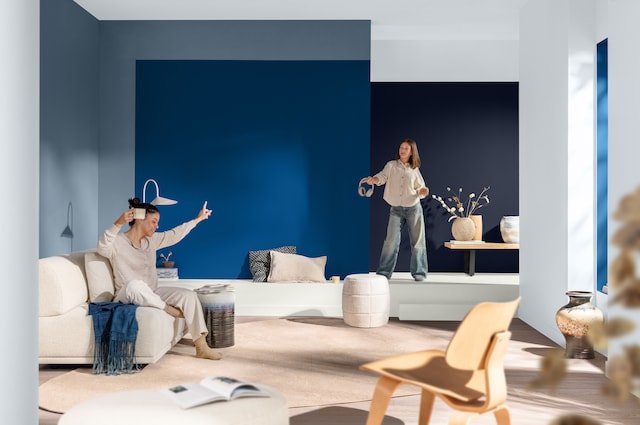
Get into the swing of things with Rhythm of Blues, our Colors of the Year for 2026. It’s an upbeat and versatile color family based around three shades that are designed to bring calm, balance and energy. The focus is on your space, your pace to help you create a visual soundtrack that gets your mojo working.


